
PhotoLesa's photography gear provided by:


 There’s nothing quite as powerful as color, for within it lies the ability to evoke emotion, capture attention, and send a message. But even if you had color theory in college (and who remembers that?!), picking colors that go together can be an exercise in frustration. Some colors look good together, some don’t, and who the heck knows why. Where do you start? Is there some kind of voodoo involved in creating a visually pleasing color scheme?
The answer is yes and that’s exactly what you’re going to learn today. By the time you finish reading, you’ll understand the basics of color theory, you’ll know what a color wheel is and why it’s useful, you’ll know exactly where to start when choosing a color palette manually, and you’ll know where to go for tools that automate the process.
First, let’s cover some basic terminology.
If we were to define color, we could say it’s a visual response to wavelengths of light, and it’s identified as red, blue, green, etc. Color requires light, for without light there is no color. (That bright purple tie-dyed tee looks black in the dark, does it not?)
Typically, three different terms are used to describe color: hue, saturation, and brightness (or value). Though each have different meanings, these attributes work together to form all the glorious colors our little eyeballs can perceive.
Hue can mean to take on color, or to become colored, though more often it's used to refer to a particular color, such as red, green, blue, and so on. A pro designer might also add that hue refers to “pure” color; a color that has had no white or black added to it, thereby altering its brightness.
Saturation is a degree of color strength or intensity (which makes me want to call it brightness, but I can't because that's another attribute altogether). Saturation can be described as the richness or vividness of color. For example, a highly saturated hue has a vivid, intense color. A less saturated hue looks dull and gray. Think vibrancy and you’ll have this one down pat.
Brightness determines how light or dark a color appears, which is usually stated in percent. I like to think of brightness as the sun. For instance, if you were to look directly at said sun, you would go completely blind. Kidding. You’d see something close to white, which would be 100% brightness. The absence of the sun—think nighttime—would result in something very close to black, which would be 0% brightness.
There are a couple of other terms riding on brightness’s coattails, that of tint and shade. Adding light (white) to a color results in what’s called a tint, in which the color becomes lighter. Adding dark (black) results in a shade of the original color, and it becomes darker.
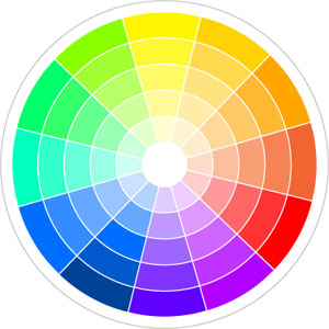
We won’t dive too deeply into the science of color relationships—lest you leap off the nearest ledge—but I will say that all colors are related because they are derivatives of each other, as you’ll soon see. Let’s take a more visual route to how colors are related by casting our eyes upon The Almighty Color Wheel (insert Gregorian chant here). Once you understand how to use the wheel, picking a perfectly pleasing palette is a snap (say that three times fast).
The color wheel is a brilliant tool, really. It's a round map containing all the visible colors arranged by their relationship with one another.
To understand how it works, let’s dissect it a bit. We’ll start off by identifying the three basic colors: yellow, blue, and red. These are called primary colors and from these colors, all other visible colors arise.
As you might suspect, by mixing equal parts of the secondary colors, we get a third set of colors called tertiary colors.
That’s all well and fine, you might say, but how does this help me pick a scheme? Instead of just talking about it, let’s put theory into practice.
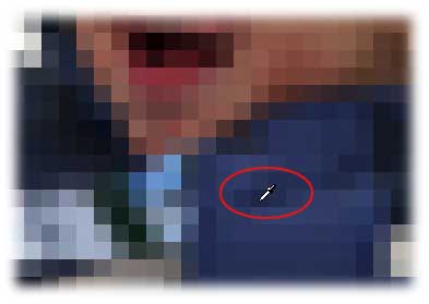
Start with a color you already have. Every project starts with something, be it a photo (like this cute little skier guy), a piece of scrapbook paper, company logo, or other piece of art.

Fish a color out of the photo using Elements’ Eyedropper Tool, such as this nice blue shown below TIP: To better see what colors make up a photo, choose Image > Resize > Image Size and enter 50 pixels in the width box. Click OK and zoom way into the image until you get a big blocky mess, like this:
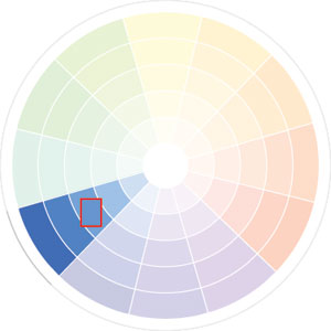
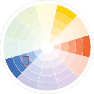
Choose colors in the same wedge for a monochromatic color scheme.
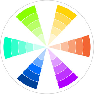
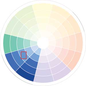
Choose colors from the wedges on both sides of the original color for an analogous scheme.
Monochromatic

Analogous

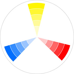
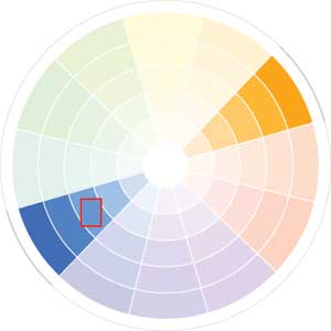
Complement

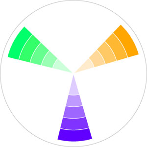
Split Complement

If this whole color picking business still feels overwhelming and you long for something more automatic, never fear; there are helper applications aplenty. Most work in a similar manner, in that you pick a base color (something that already exists in your project files), and the software generates the rest of the scheme for you. Below are a few notable selections gleaned from the masses:
Color Scheme Generator 2. Free online version.
Color Schemer. Free online version or $50 download, Mac and Windows versions.
GenoPal. $35 download, Mac and Windows versions.
Painter’s Picker (replaces the Photoshop Elements’ and Photoshop CS2 color picker with that of a color wheel). $16 download, Mac only.
We’ve merely touched on the basics of color theory in this article, so I wholeheartedly invite you to go forth and learn more. Do a Google search on “color theory” and you’ll be inundated with links. Or pick up a book like“Color: Messages and Meanings” by Leatrice Eiseman. No matter where you go for additional information, get yourself a good old fashioned color wheel, either of the physical or online variety (there are a gazillion available on Amazon.)
Until next time, happy color picking!


PhotoLesa's photography gear provided by: