
PhotoLesa's photography gear provided by:


 “A picture is worth a thousand words,” the saying goes, and I really believe it to be true. No matter what you’re creating, a striking image has the power to deliver your message better than anything.
But to create or download? That is the question!
If you don't have the time or skillset to create imagery yourself, consider downloading stock. This option used send dollar-shaped chills rippling down one's spine; however, several companies have sprung up in the last few years offering high quality, royalty-free imagery (you pay for it once and get to use it many times) for super affordable prices.
The company who started it all—and by far my favorite and pays a portion of my salary!—is iStockphoto.com. Not only do they sell photography, but they have a large database of illustrations, Flash animations and components, plus stock video clips. You can find anything just by searching for a word, or words, which describes the image you’d like to find.
Tips for picking the right image
You have precious few moments to grab someone’s attention, so when it comes to imagery, pick something eye-catching, powerful, and/or colorful. After all, if can't snag the person’s attention, it’s unlikely they’ll read your copy! This is especially true in dealing with direct marketing pieces. Because it's unsolicited, you've got to work extra hard to get a reader to notice your piece in a big stack of mail, much less pick it up and read it.
Using the format of a direct mail postcard, let's illustrate a few tips for communicating with imagery. NOTE: Some of the ideas below came from a great magazine called Before & After. If you're not already a subscriber, check it out! (You can also buy single issues with your iStockphoto.com credits!)
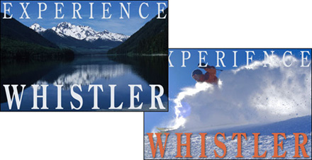
Tip #1: Let the image tell the story for you, as in the case of this postcard (or web ad tile) promoting Whistler as a ski destination. Nothing grabs attention like a beautiful image! If your own photographers don’t have the travel budget or haven’t snapped the perfect image, maybe one of the 37,000+ contributors over at iStockphoto has.
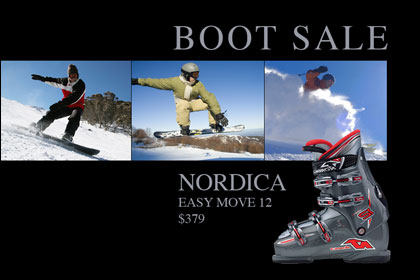
Tip #2: Use stock in conjunction with a product photo to both identify with the customer and create more visual interest. For example, three iStockphoto.com images form a type of “photo path” that leads the reader’s eye to the product I'd like to sell them.
Tip #3: Sometimes a good product photo may not exist, so rather than stage a photo shoot, see if there's a stock image that will work instead. In this ad, a simple photo of piano keys does the trick. By feathering the edges of the image into an oval vignette, we create an air of elegance and class even though we used a common photo.

Tip #4: Add an unusual background to the piece. For this fabric store, enlarging the stock image of a burlap background creates something eye catching and unique. At full size on a postcard, this background image has a huge impact and will stand out in a pile-o-mail.

Tip #5: If you’re at a complete loss as to what kind of imagery to use, think about the tools used in that particular business (tools of the trade, so to speak). For a doctor's office it might be a stethoscope. For a landscaping company it might be a hand trowel, a plant, or some seeds. In this fake Williams & Sonoma ad, I’ve used something commonly found in their store: wooden spatulas. Used as a background at a large size, the photo is very eye catching.

Tip #6: Attractive imagery at a large size can really create impact. This dog is so cute and the background is so nice and clean, you just can’t help but read the text. The fact that it’s a quote from a dog also helps; it’s out of the ordinary and unexpected.

Tip #7: Get the most bang from your buck by using the same stock image twice—in the same piece. Honest! Place the image twice—use it once at a normal size, and again greatly enlarged and screened back.

Tip #8: Consider using conceptual imagery, such as this money growing out of pot in the screen shot above. Conceptual imagery is also something out of the ordinary and unexpected, thus it can be visually interesting on its own.
Tip #9: Finally, nothing communicates to people like other people pictures. If you don’t have good people pictures of your staff, your group, association, students, etc., go buy them over at iStockphoto.

As with any digital content, you’ve got to be cognizant of where you’re getting it from and what exactly it is you’re getting. Make sure it’s truly high quality imagery and it’s legal for you to use. Internet theft, scams, and copyright violations are rampant, so it’s important to read the licensing agreement before you purchase and download. Stick with imagery from a reputable company and you’ll be fine.
The thing I love about royalty-free licensing is that you can use the image for any promotional usage you can dream up, including newsletters, web sites, ads, presentations, banners—anything that promotes you, your product, or your service. Once you purchase a royalty-free image and it’s downloaded to your computer, it’s yours to use as many times and in as many different projects as you’d like with no additional fees.
I hope you can now see how easy it is to both find and afford great imagery. There’s just no excuse not to use great graphics anymore! Furthermore, it can really be fun finding the perfect image for your project and rewarding when you see your audience connect with your message.


PhotoLesa's photography gear provided by: