
PhotoLesa's photography gear provided by:


Ed. Note: This article first appeared in the most amazing magazine ever, called Elements Techniques. It's packed full of tutorials just for Elements users, along with all kinds of photography tips. You can subscribe to it by clicking this link.
When you think of all variables that come into play when you're capturing images, it's a wonder any of ‘em turn out halfway decent at all. Just think about it: Unless you're hauling around your own light kit, you're dependent on ambient light sources—which are less than perfect on a good day—and then it’s up to you to set the camera properly so you don’t over- or underexpose the image. Even if the stars are aligned and you get all that right, the camera itself may introduce a color cast. Arg!
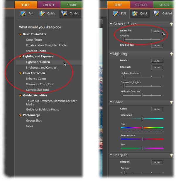
Thankfully, Elements has several tools that can help fix most any lighting or color problem you might have. For example, you can pop into Guided Edit Mode and choose to lighten or darken the lighting, enhance the color, or zap a color cast by clicking the text buttons as shown in the image below. In Quick Edit Mode you can click the Smart Fix button and let Elements have a go at fixing both color and lighting, then use the handy sliders to tweak the image further.
These fixes are great when you’re starting out with Elements and they’re darn handy when you’re pressed for time. But to become a real pixel wrangler, you've got to kick it up a notch and learn to use Levels. With a single Levels adjustment you can fix lighting problems, increase contrast, and balance the color in your image. The adjustment changes the intensity levels—hence the name—of the color categories in your image: the shadows, midtones, and highlights. Once you get the hang of it, Levels is a very visual and intuitive way to improve your images. And because it’s available as an Adjustment layer, it’s nondestructive and won't harm your original image. Whee!
In this article, you'll learn how to use Levels adjustments in a variety of ways so you can pick the one you like best. But first you need to get up close and personal with the mighty histogram, your secret decoder ring for interpreting problems in your image.
A histogram is a visual representation—a collection of bar graphs, really—of the information contained in your image. Once you learn how to read it, you'll begin to understand why your image looks the way it does. More importantly, you'll learn how to use the tools in Elements, namely a Levels adjustment, to tweak the histogram in order to produce a better image. It sounds complicated, but once you watch it in action you'll see it's pretty straightforward...and super powerful.
Elements automatically displays an editable histogram when you create a Levels Adjustment layer, as shown below:
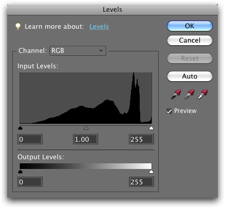
A histogram looks like a mountain range, which is a perfectly fine way to think about it (more on that metaphor in a minute). Its width represents your image's tonal range—the range of colors between the darkest and lightest pixels—on a numeric scale of 0 to 255. Pure black (0) is measured at the far left, and pure white (255) is on the far right. All told, 256 values are measured which represents the minute gradations between a total absence of light (black) and full-on illumination (white). The histogram's height at any particular spot represents how many pixels are at that particular level of brightness. Using the mountain analogy, a noticeable cluster of tall and wide mountains mean that particular brightness range makes up a good chunk of your image. Short or super skinny mountains mean that brightness range doesn't appear much. And a big, flat prairie means there are few or no pixels in that brightness range.
A glance at the histogram, in other words, can tell you whether you've got a good balance of light and dark pixels, whether the shadows or highlights are getting clipped (see note below), whether the image is over- or underexposed, and whether it's been adjusted before. In fact, many digital cameras can show you a histogram on its display screen (though you may have to root through your owner's manual to learn how to turn it on). Once you get comfy with histograms, you can use it to see whether the shot you're about to snap will have good exposure.
POWER USERS TIP: Clipping is the term used when a light pixel is turned pure white, or when a dark pixel is turned pure black. When this happens, the pixel is stripped of all detail. As you might imagine, clipping in the highlights can be more worrisome than in the shadows, because the highlights usually contain more important details than those found in the dark shadows.
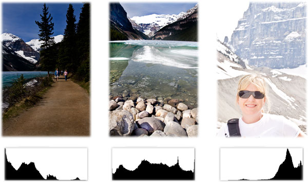
Here are a few tips for understanding histograms, some of which are shown in the figure below (NOTE: The color of the backgrond of the histograms shown here have been changed to white so you can see them more easily.)
Happily, you can fix a lot of these problems using Levels. You can smooth the height of the histogram's mountains thereby balancing color, and you can widen the mountain range to expand your tonal range and increase contrast. However, there's a wee bit-o'-setup you need to do first to make Levels work a little better.
In order for a Levels adjustment to fix the colors and lighting in your image, you need to give it some guidance on what you want those colors to be. You can do that by setting targets for the three categories of color found in an image. They include:
Setting target colors is a bit of a pain, but if you save the settings you'll only have to do it once:
Step 1: Choose > Enhance > Adjust Lighting > Levels. Even if you don’t have an image open, Elements will open a Levels dialog box, like the one shown here. You can also press Command + L on a Mac (Ctrl+L on a PC).
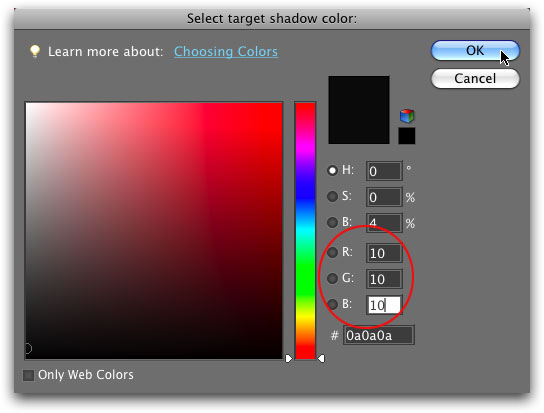
Step 2: To set a target shadow color, double-click the black eyedropper toward the right of the dialog. In the resulting Color Picker, enter 10 in the R, G, and B fields (since you'll be in RGB mode the majority of the time). The reason you want to pick 10 is because on the 0-255 range of brightness levels, 10 is a very dark gray. Once you start using Levels, this gives you nice, dark shadows, without them being so black that you can't see details. Click OK when you're finished to close the Color Picker.
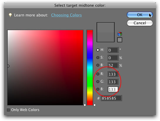
Step 3: To set your target midtone color, double-click the gray eyedropper. In the Color Picker, enter 133 in the R, G, and B fields. This gives you a nice charcoal gray that's just a touch lighter than 50%. Click OK to close the Color Picker.
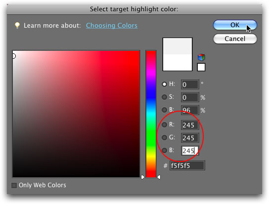
Step 4: To set a target highlight color, double-click the white eyedropper. When the Color Picker opens, enter 245 in the R, G, and B fields. This helps you get highlights that are really light gray instead of pure, blinding white. Click OK to close the Color Picker.
Step 5: Click OK to close the Levels dialog box. When Elements kindly asks if you want to save the new target colors as defaults, click Yes.
Now that you've set your target colors, you're ready to start using Levels. Find a troubled image, pop it open, and proceed with the following steps.
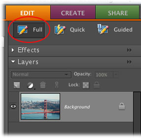
Step 1: Take a peek at the top right of your screen and make sure you’re in the Edit workspace, and then click Full.
Step 2: Locate the Layers palette on the right side of the screen. If you don’t see it, choose Window > Layers). Click the little flippy triangle to the left of the word Layers to expand the palette (if it’s not already expanded).
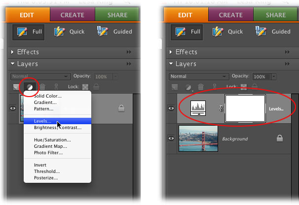
Step 3: Click the half black/half white icon at the top of the Layers palette and choose Levels. This creates a Levels adjustment layer, which simply means that the adjustment you’re about to make will occur on another layer entirely, instead of on your original image. Using adjustment layers gives you a lot of editing flexibility because you can:
Several of those items are beyond the scope of this article, but hopefully you get the picture about how useful adjustment layers can be. Now it’s time to actually adjust your image (finally!). Feel free to choose between the following methods to get it done.
By using a set of three sliders, a Levels adjustment lets you reshape and expand the information in your histogram. As shown below, the black slider at the far left of the histogram represents the shadows in your image. It starts out at 0, which is the numeric value for pure black. The white slider on the right represents highlights, and it starts out at 255-pure white. To give your image the greatest tonal range and contrast, you need to situate these sliders so they point to wherever your histogram's values begin to slope upward (at the foot of your mountains, so to speak).
In other words, if there's a gap between the shadow slider and the beginning of the histogram, drag that slider to the right. If there's a gap between the right-hand end of the histogram and the highlight slider, drag it to the left. The figure below should make all this repositioning stuff crystal clear.
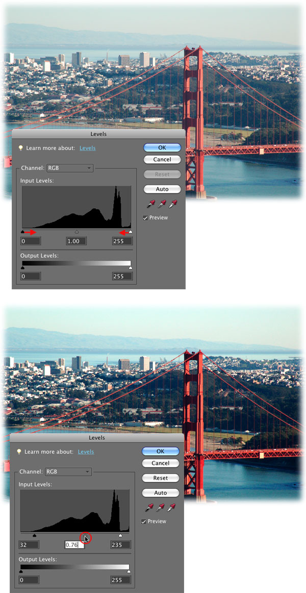
When you move the sliders, Elements adjusts the tonal values in your image accordingly. For example, by dragging the highlights slider inward to 235, Elements changes all of the pixels in you image that were originally at 235 or higher to 255 (pure white). Translation: they get brighter. Similarly, if you move the shadows slider inward to 32, Elements changes all of the pixels with a brightness level of 32 or lower to 0 (pure black), which makes them darker. The levels of the pixels in between get redistributed accordingly, which gives you an overall contrast boost by increasing your tonal range (widening your mountain range).
The gray slider in the middle (circled at bottom in the image above) lets you brighten or darken the image by changing the intensity of the middle range of grays. Drag it to the left to lighten your image, or to the right to darken it. Because the gray slider focuses on the midtones, it won't make your highlights too light or your shadows too dark—unless you go hog wild and drag it all the way left or right!
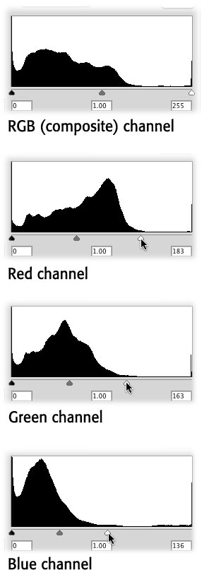
Near the top of the Levels dialog box is the Channel pop-up menu, which lets you view and adjust the composite channel—a combined histogram of the red, green, and blue channels—or each channel individually. If each channel's histogram differs greatly, it's worth adjusting each one separately instead of adjusting the RGB (composite) channel. If the histograms are almost identical, you can get away with adjusting the composite channel only, as you did above. In the figure below, you can see the gaps on the right side of each red, green, and blue histograms vary quite a bit so in this case, you should adjust each channel separately. Be careful not to drag the sliders too far in, or you'll make parts of your image pure black or white (or the colors you set as your black and white targets).
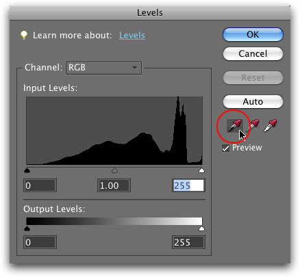
Another way to adjust Levels is to use the eyedroppers on the right side of the dialog box. Instead of dragging the sliders directly below the histogram, you can use the eyedroppers to sample pixels that should be black (the darkest shadows that contain details), those that should be white (the lightest highlights that contain details), or neutral gray (midtones). If you use this method, Elements takes care of adjusting the sliders for you. With an image open, follow these steps:
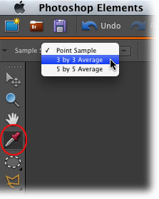
Step 1: Grab the Eyedropper tool and change the Sample Size pop-up menu to “3 by 3 Average.” Press I to activate the Eyedropper tool. Because you're about to use the eyedroppers to reset your black and white points, you need to change the way the tool measures color (the eyedroppers in Levels uses the main Eyedropper tool's settings). In the Options bar, the Sample Size pop-up menu is automatically set to Point Sample, which means the Eyedropper samples exactly one pixel when you click. By changing it to “3 by 3 Average”, you tell Elements to average several pixels around the spot where you click, which is much better for color correction.
Step 2: Create a Levels Adjustment layer. Click the half-black/half-white circle at the top of your Layers palette and choose Levels from the pop-up menu that appears. Elements adds an Adjustment layer to your Layers palette and opens the Adjustments palette.
Step 3: In the Levels dialog box, click the black eyedropper. The right side of the dialog box sports three eyedroppers—the black one resets your image's black point (shadows), the gray one resets the gray point (midtones), and the white one resets the white point (highlights). Simple enough! Mouse over to your image and click an area that should be black. In most cases, it's pretty obvious what part of your image should be black, though sometimes it's hard to tell and there are a few things to consider before you click. First, you want to pick a point that's near the focal point of your image. For example, if you're correcting a portrait, find a dark shadow that's near your subject's face. Second, try to pick an area that has a little detail in it instead of an area that's pure black (if it's pure black then most likely there's nothing there!).
When you click with the eyedropper, you'll likely see the colors in your image shift a bit. If you don't like the results, click somewhere else to set a new black point or undo your click by pressing Command-Z on a Mac (Crl+Z on a PC).
Step 4: Click the white eyedropper to select it and then click an area in your image that should be white. The same rules apply when it comes to choosing a new white point: Try to pick an area that's close to the focal point and not pure white (because it won't have any detail). You also don't want to pick a white point that's a reflection from a light source, because it's not a true white. You can use the same Option-drag on a Mac (Alt-drag on a PC) trick to find the lightest highlights, though this time your image turns completely black. As you drag the highlight slider to the left, the first areas that appear in color are what you're after.
Step 5: Select the gray eyedropper and then click an area that should be neutral gray (pixels that are about 50% gray in color.
That's it! To see before and after versions of your image, turn off the Levels Adjustment layer's visibility. In the Layers palette, click the visibility eye to the left of the Levels Adjustment layer to turn it off and see if your adjustment made a difference.
As you can see, it doesn’t take serious voodoo to use a Levels adjustment, and it can sure improve the color and lighting in your image. Until then, may the Levels force be with you!


PhotoLesa's photography gear provided by: