
PhotoLesa's photography gear provided by:


Ed. Note: This article first appeared in Photoshop User magazine. If you're not a subscriber, you can sign up here!
Few design projects are as nerve-racking, and important, as designing your own business card. Just like the clothes on your back, your business card tells the recipient if you’re professional, artistic, or a big ol’ ball of cheese. Also, aside from the aesthetic message, you’ve got to pack a ton of info into a very small space; company name, your name, logo, URL (it’s shocking how many folks leave that out), phone, and email address—you’ve got to include them all.
Your first step is to pick a printer and get their document specifications.
Second, create a Photoshop template by following these steps:
Step 1: Create a new document by pressing Command + N (PC: Ctrl+N). Enter “business card” in the Name field and type the following into the width and height fields: 1088 pixels x 638 pixels (standard 3.5” x 2” business card size). Enter 300 for resolution and choose CMYK for Color Mode at 8-bit. Choose White from the Background Contents pop-up menu and click OK (you can always change the background later).

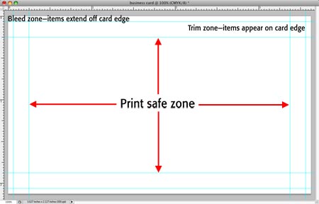
Step 2: Drop guides to mark the print safe zone area. Placing your content within this area ensures that it won’t print too close or hang off the edges of the card. Choose View > New Guide and add a vertical guide at .25”. Repeat the process and add a horizontal guide at .25, too. To mark the trim line (where the card is cut), drop vertical and horizontal guides at .063”. Drop similar guides on the right side of your car by adding a vertical guide at 3.373” for print safe and 3.563” for trim. Last but not least, drop horizontal guides at 1.877” for print safe and 2.067” for trim.
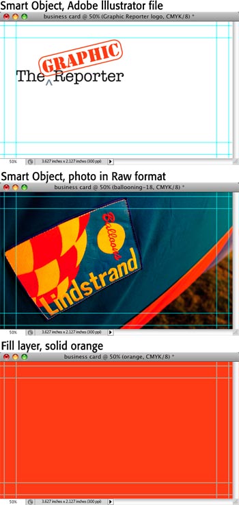
Step 3: Place your logo (or photo background) as a Smart Object. Choose File > Place and locate the art on your hard drive. If it’s a logo, keep it fairly big and move it to the left side of the card. If you make it smaller and later decide to make it bigger, press Command + T (PC: Ctrl + T) to summon Free Transform and increase its size. If it’s pixel-based, don’t make it bigger than it’s actual size or it may pixelate. If it’s vector-based, it’ll never pixelate.
If you’ve placed a photo and want it to hang off the edges of the card (called a bleed), make sure it extends past the trim guide to the document edges (be sure the photo has a fairly “calm” spot for text!).
To add a solid color background, choose Layer > New Fill Layer > Solid Color, grab a color from the resulting Color Picker, and click OK. To snatch a color from your logo, click it with the Eyedropper tool first. With a Fill layer, experimenting with colors is as easy as double-clicking the Fill layer to open the Color Picker. Sweet!
Below are the beginnings of a business card:
Step 4: Press T to grab the Type tool, click within the document and add your text. Keep these text tips in mind:
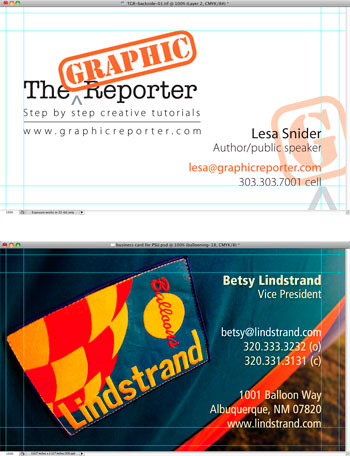
Make sure to include your contact information, as shown below (though I choose to leave off my mailing address). On business cards, a right alignment usually works best.
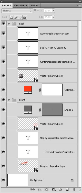
Step 5: If you’re designing a double-sided card, Shift-click to select the layers and choose New Group From Layers from the Layers panel menu. Name it “front” and turn its visibility eye off. When you finish designing the back, add them to a group named (cleverly) “back”. Here's a shot of my Layers panel:
Step 6: Save your layered file as a native Photoshop document and then export it as a TIFF by choosing File > Save As and picking TIFF from the format pop-up menu. Turn off the Save Layers option and in the next dialog, set Compression to None. If your printer wants a PDF, choose PDF from the format menu and in the resulting dialog, click Compression and choose Do Not Downsample from the Options menu.
Here's the final product:
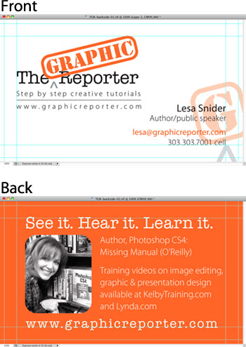
For extra pizzazz, pick an artistic element from your logo, make it bigger, reduce its opacity and hang it off the edge of the card, as shown here (top). You could also use solid color Shape layers in the background for visual interest. The possibilities are endless!
Until the next time, may the business card creating force be with you!


PhotoLesa's photography gear provided by: