
PhotoLesa's photography gear provided by:


Lest you think the Feather option is just about romance, let's use it in a graphic design scenario. For example, let's say we're creating a colorful ad for visiting Vermont in the fall. However, after placing text atop the leaf photo, the image looks a little too busy. What can we do? We can use the Feather option in conjunction with a rectangular selection to tone down that particular area of the photo, so the text can be read more easily.
We'll do this in a couple of different ways using the leaf photo from last week's Fabulous Feathers, Pt. 1: Vintage Vignette.
Step 1: Begin by opening the leaf photo and immediately duplicating the Background layer by pressing Command-J (PC: Ctrl-J). We'll use this layer copy in the next effect (you can turn its visibility eyeball in the Layers Palette off for the moment.)
Step 2: Press T to select the Type tool and type "Visit Vermont" in the font of your choice. Command-click (PC: Right-click) the New Layer icon at the top of the Layers Palette to create a new layer below the type layer we just made. This new empty layer should live between the type layer and the leaf background copy layer, as shown below:
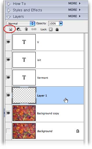
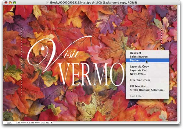
Step 3: With the empty layer selected, press M to select the Rectangular Marquee Tool and draw a selection around the text area. Control-click (PC: Right-click) within the selection and choose Feather from the resulting contextual menu. Enter 10 pixels and click OK.
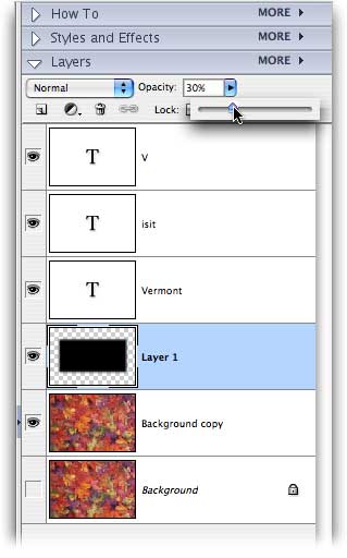
Step 4: Next, take a peek at the bottom of the main Toolbox and set your color chips to the default of black and white by pressing D. Press X until black is in the top position (called the foreground color chip). Fill the selected area with black by pressing Option-Delete (PC: Alt-Delete).
Step 5: Solid black is a bit too dramatic for our ad, so let's lower the opacity of that layer to about 30%.
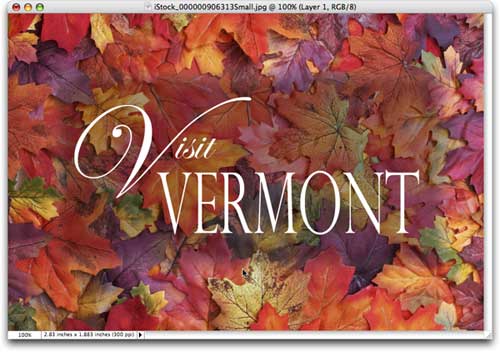
As you can see, a soft and slightly opaque black fill tones down the photo just enough for the text to be readable. A simple yet effective technique.
A variation on the above theme is to draw attention to the center of our ad by making it color, while the rest of the photo is grayscale. We'll use the Background copy layer we made above in Step 1 for the grayscale bit.
Step 6: Get rid of the color fill layer we made above in Step 4 by dragging it to the Trash icon at the top of the Layers Palette. Make sure both leaf layers are visible (their visibility eyeballs should be turned on), and click once to select the Background copy layer.
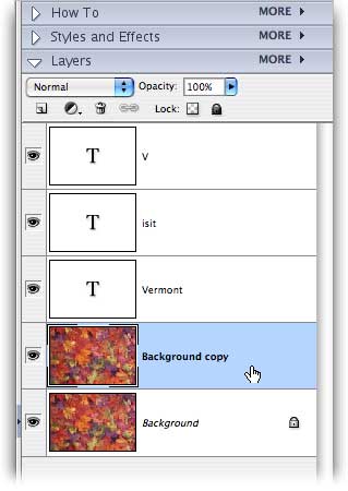
Step 7: Zap the color from this particular layer by pressing Shift-Command-U (PC: Shift-Ctrl-U), or by choosing Enhance > Adjust Color > Remove Color. You should be staring at a grayscale image now.
Step 8: With the grayscale layer selected, press M to select the Rectangular Marquee Tool and draw a selection which encompasses the text area. Control-click (PC: Right-click) within the selection and choose Feather from the resulting contextual menu. Enter 10 pixels and click OK.
Step 9: Press Delete to punch a soft, rectangular hole through the grayscale layer. This will allow the original color to show back through the selection area.
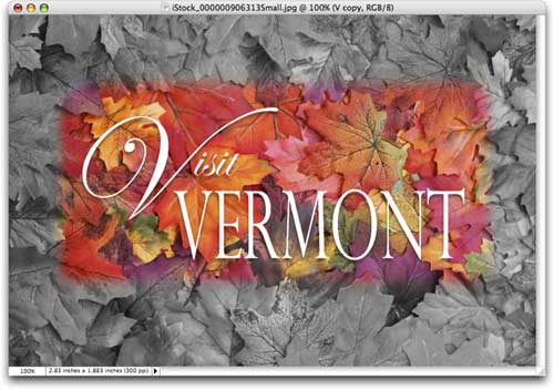
For a final touch, I added a soft drop shadow to the text to ensure legibility. We could have reversed the color and grayscale areas by inverting the selection like we did in the first technique. Just press Command-Shift-I (PC: Ctrl-Shift-I) before you press Delete. This would make the outside edges color, and the selection area grayscale.
As you can see, we've produced three different, very practical effects all using the Feather option on selections of differing shape. So the next time you want to highlight a specific portion of a photo, either by fading it onto a solid background or a completely different image, just reach for the Feather option. It works with any selection of any shape, and it's just the thing for creating a romantic vignette. Similarly, it's also useful for toning down a portion of a photo so it may receive text, and for creating a partial color/grayscale effect.
Just remember: If you have marching ants, you're free to feather! Until next time, may the creative force be with you all.
Oh, and in honor of Turkey Day, check out last year's gradient tutorial. Even after a year, the screen shots toward the end of the tutorial still crack me up :)


PhotoLesa's photography gear provided by: