
PhotoLesa's photography gear provided by:


You've seen the photo effect everywhere, but perhaps couldn't call it by name: The original color has been drained from the photo, and replaced by a dramatic blue-ish, yellow-ish, green-ish, or purple-ish color cast. This is called a duotone, and it's been a favorite of Photoshoppers for years.
In the full-blown version of Photoshop there's a specific command for this effect; however I'm here to tell you that it's easily recreated in Elements. Oh yes, dear grasshopper; let me show thee how :)
Before we dive in, let's define what a duotone really is. Simply put, a duotone is an image made up of two colors. Period. You may also hear it referred to as a "two-color halftone" spawned from a one-color image. Sounds complicated but it's not; just think of it as printing a photo with just two ink colors. Though a duotone can be any color combination, the most common is black plus something else.
I suspect a true duotone aficionado could whip out an enlightening essay to insert here, but I'm going to offer just a few basics:
NOTE: To the Photoshop users reading this tutorial, there are a few more considerations:
Let's stop yappin' and do it!
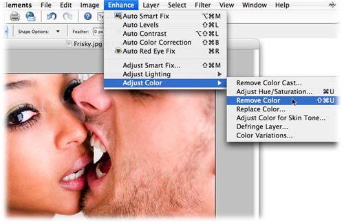
Step 1: Pop open a photo and choose Enhance > Adjust Color > Remove Color, or just press Command + Shift + U (PC: Ctrl + Shift + U).
Step 2: Hop up to the top right corner of your screen and click the QuickFix button. This is going to revolutionize your workspace.

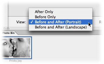
Step 3: Towards the bottom of the screen, choose View > Before and After (Portrait). This is going to give us a before and after view, side by side.
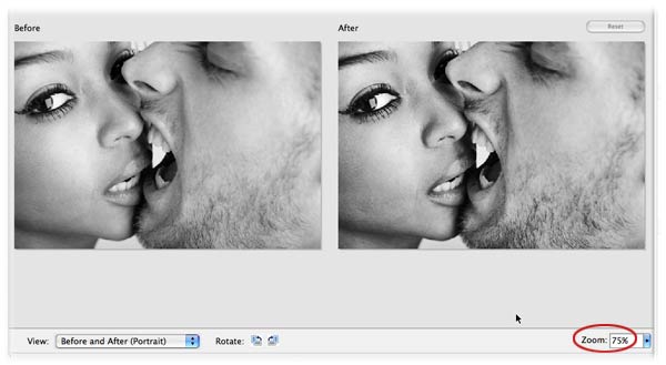
Step 4: Reduce the zoom factor so you can see both images, like so:
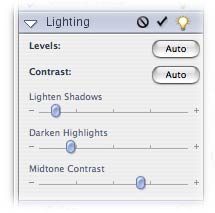
Step 5: On the right hand side of your screen you'll see several palettes, one of which is Lighting. By tweaking the sliders here, we can pump up the contrast of our image, and make a more visually striking grayscale. Here I increased all three sliders, though your own adjustments will vary by photo:
Step 6: Since we took all the color out of the photo, we need to add a little back before we can do any color changing. Do this by dragging either the Temperature or Tint sliders in either direction.
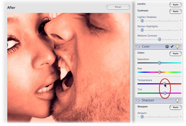
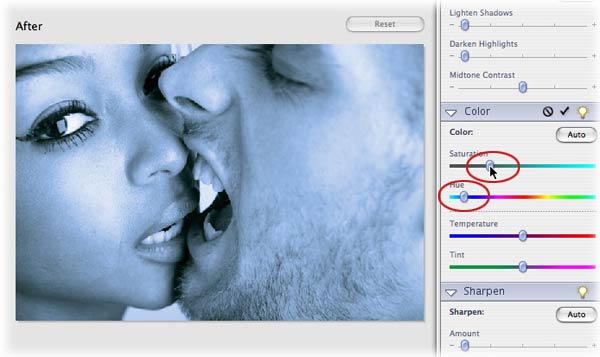
Step 7: Now we're free to move about the country... I mean adjust the Hue and Saturation sliders (grin). Yes, you could have adjusted them earlier, but since there was no color *in* the photo, nothing would have happened. Below I've moved the Hue slider ot the left into the blueish-purple area.
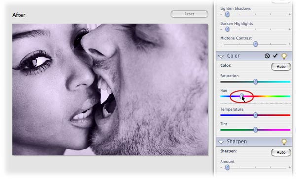
Just keep adjusting the various sliders in the Color palette to get just the right color cast. Below I've moved the Hue slider back into the pinks and reds, and lowered the Saturation so the color wasn't so bright.
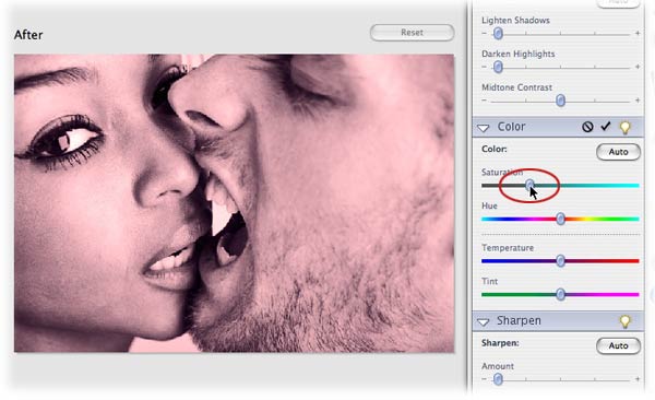
Below, I've adjusted the sliders to achieve a blue-ish cast:
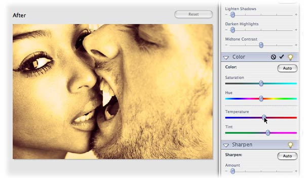
And a yellow-ish cast:
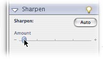
Step 8: Last but not least, I increased the Sharpen slider just a touch:
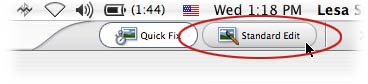
Step 9: Preserve your changes by clicking the Standard Edit button at the top right of the screen.
To illustrate, let's take a look at where we started and where we ended up:
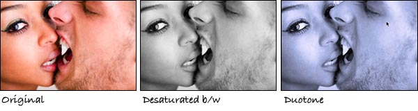
What a difference color makes! Just think about the mood you want to convey... a duotone may be just what ye ole' pixel doctor ordered.


PhotoLesa's photography gear provided by: