
PhotoLesa's photography gear provided by:


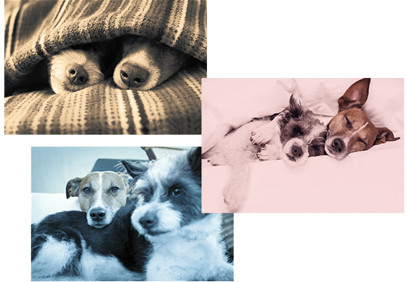
Color trends come and go, though when it comes to photographic treatments, some color effects are here to stay. For example, adding a brown tint to a black and white image produces a sepia tone that evokes a vintage or romantic feel. Likewise, adding pastel pink or blue—Pantone’s colors of the year are rose quartz (13-1520) and serenity (15-3919)—to a black and white image evokes a soft, dreamy feel. These ageless and classy techniques limit the photo’s color palette, which puts focus on the image content. Similarly, cross processed looks are wildly popular, though with this effect you keep the image’s color yet shift it in interesting ways (the term refers to dark room days where the color shift was produced by processing the image using the wrong chemicals). While crafting these effects yourself can feel daunting, it doesn’t have to. As luck would have it...click here to read the step-by-step tutorial on Macworld.com


PhotoLesa.com founder Lesa Snider is the author of Photos for Mac and iOS: The Missing Manual, Photoshop CC: The Missing Manual, The Skinny ebook series, and over 40 video courses. Lesa writes a weekly column for Macworld, the Beginner’s Workshop column for Photoshop User and she contributes monthly columns and videos to Photo Elements Techniques.


PhotoLesa's photography gear provided by: